This article has been indexed from MacRumors: Mac News and Rumors – Front Page
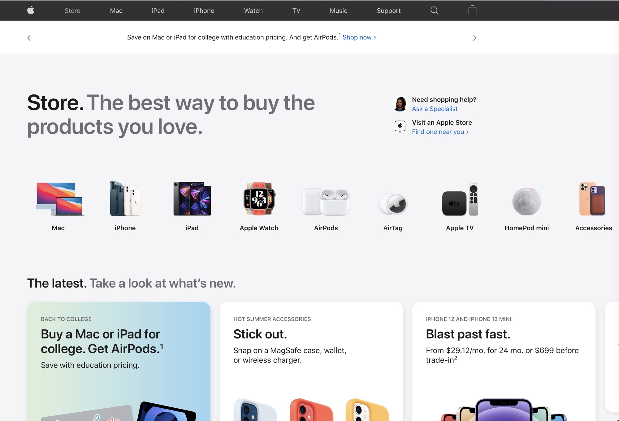
Following a short downtime, Apple has updated its Apple.com website to add a dedicated “Store” section, which has a new look.

There’s a new “Store” tab in the top navigation bar on the website, which goes to a dedicated online store portal where customers can select from a product carousel with cards that include Mac, iPhone, iPad, Apple Watch, AirPods, and more.
The design is similar to the design of the Apple Store app, and the main store page also features current deals and promotions, along with accessories and products that Apple is highlighting. Navigation is done through horizontal scrolling, which feels more natural on iOS devices than on the desktop.

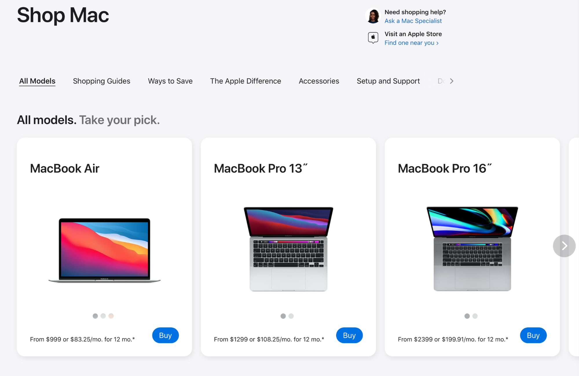
Clicking into a product category like Mac presents all of the different options, along with access to comparisons and shopping specialists, accessories, and other information.

Choosing to “Buy” a product through the store interface goes to the standard purchase pages that can also be accessed through any of the standard Mac, iPad, iPhone, or Watch categories.
The Apple online store previously had a store tab, but it was removed in an earlier redesign. The return of the tab will make it easier for customers to get to the product they want to purchase without having to navigate through the various product pages for each device to find the “Buy” button.
This article, "Apple's Website Gains Redesigned Store Section and Dedicated 'Store' Tab" firs
[…]
Content was cut in order to protect the source.Please visit the source for the rest of the article.
Read the original article: Apple’s Website Gains Redesigned Store Section and Dedicated ‘Store’ Tab